Have you ever wondered why companies make a big deal when they rebrand their image? From the almost unnoticeable change in the logo design to the slight adjustment of the colours of their logo, a company’s brand identity takes into consideration the study of colour theory and how it can affect and manipulate us in choosing the right service.
What’s in a brand?
A company’s branding condenses its vision, mission, product, and service all into one compact image. Future iterations and expansion through television ads, merchandise, and even staff uniforms are rooted in the brand’s logo. From t-shirt printing Nottingham offers to brand management offices in New York, all these industries require a stellar understanding of how colours work towards building an effective brand recognition strategy. Colours don’t just affect us in terms of what we want our house to look like or what combination of clothes we want to wear; they also influence us on what we choose to buy, and what service we decide to trust.
Colour in art therapy
Art therapy points to colour as an identifier or motivator for specific emotions. Some colours have a more significant impact on individuals than others either due to their personal biases or being linked to an event in their lives.
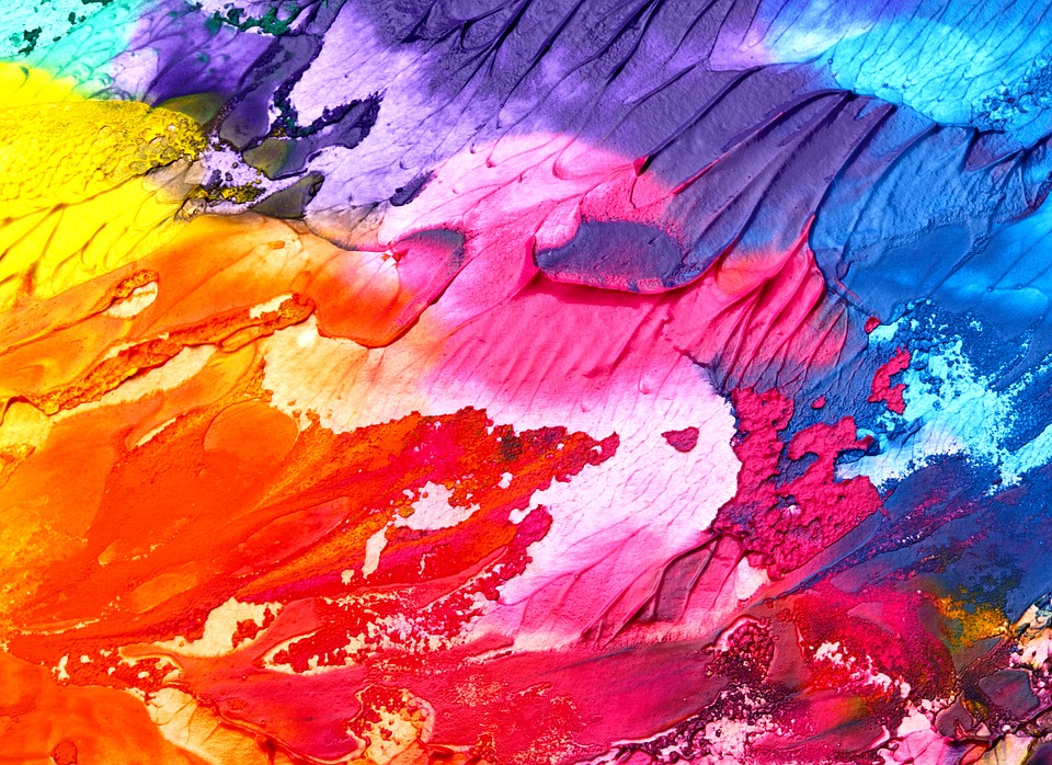
The colours of the spectrum can be divided into three different categories: warm, relaxed and neutral.
Warm colours, those that include reds, oranges, and yellows, primarily depict feelings of comfort, but can also portray rage and passion.
Cool colours, those that include blues, greens, and violets, tend to give a calming effect, but can also be related to grief and pain.
Neutral colors, by far, have the most confusing opposites. Whites, greys, and blacks can have complementing, contrasting, and interchangeable implications from formality to peace, to signs of evil and good.
Colours and their emotions
Brands go through thorough research and studies to find the appropriate colour scheme for their ads and promos. Depending on the industry that they are in and the service that they provide, some colour choices may be more effective in delivering their message compared to others.
Reds are commonly used in restaurants with familiar, well-known franchises such as McDonald’s and Burger King sporting the colour as an accent to their brands.
Blues and greens are commonly used for waiting areas, lobbies, or cafes. Light shades of blue have a calming effect on patients or people waiting in line. Bright greens follow the same result of a musky green which is used in correctional facilities and institutions to stabilise and create a sense of calmness.
Rare pairings of both warm and cool colours are apparent in industries too, with the colours red and black or blue as common choices for hospitals since the combination of colours represents life, trust, and professionalism.
Depending on the context and the arrangement of the colours, there can be a mixture of both warm, cool, and neutral colours to evoke the best emotional message of your company’s brand from the promotional material alone.
Leave a Reply