Building a website is crucial for every entrepreneur and digital brand. But the thing is, building a desktop-forward website isn’t enough in today’s digital landscape. The priority now is on mobile-forward websites, and unfortunately, many businesses are not up-to-speed on this necessity. And the numbers show how true this is: websites which are not well optimized for mobile can lose up to half of their traffic. When designing a mobile responsive website, there are certain tips and tricks you can keep in mind, to help maximize your success. Amped Local is an internet marketing agency based in San Diego, California, which helps entrepreneurs and businesses grow their ventures using SEO techniques. The experts behind Amped Local are sharing five mobile responsive design practices you need to know in 2020.
1. Think with your hands
When you’re designing a mobile responsive website, you want to think with your hands. What this means is that most of your users will be using their thumbs in order to use your website, so you want it to be designed in a way that is thumb-friendly. This may mean eliminating some things you have in the desktop version, in order to make it more user-friendly.
Related Article: 21 of the Best Examples of Mobile Website Design
2. Less is more
When designing for mobile, less is more, meaning minimal design features will take you further. In general, there’s less space to work with, and you don’t want to cram so much into the space. When content shifts from desktop to mobile, it needs to reorganize effectively on its own. The less you have on the page, the better this will look.
3. Make your key functions easy to find
What is the purpose of your website, what is the call-to-action? Whatever it is, these features and functions on your website should be easy to find. This may mean placing a button in an obvious spot, and having these links be some of the first things your customers see. Making your actions easy to find will mean more customers will be able to use your services with ease.
4. Use responsive images
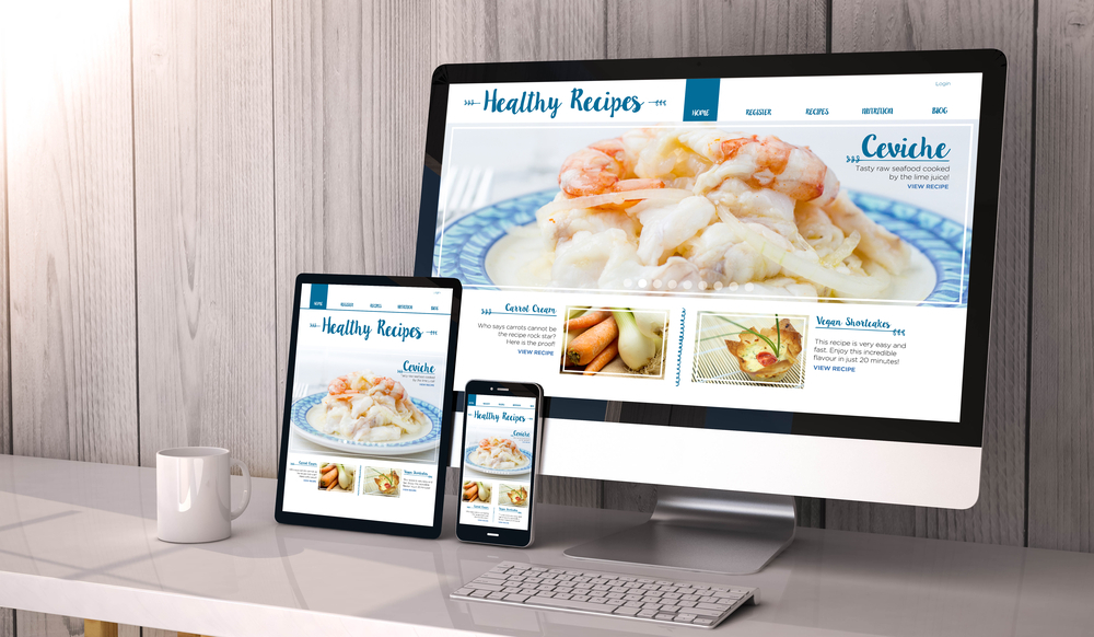
Images for desktops need to be much greater resolution than images for mobile. To optimize your user experience and loading times, you can use two different versions of the image, one for your mobile sites, and one for your desktop sites. Some website content management systems do this for you automatically, but it depends on what your service is.
5. Start with mobile-first
It’s much easier to scale a website up, than it is to scale it down. What this means is that you should be designing your website with mobile in mind, instead of designing it for a desktop experience. Then, you can add on features and make designs more complex slowly and see how this impacts your mobile experience.
More about Amped Local

Amped Local helps businesses grow their revenue using digital marketing techniques such as SEO, FacebookAds, and website mobile optimization. Amped Local was founded by Douglas James, a digital marketing expert and serial entrepreneur.
Leave a Reply